Sport for Life
The Challenge
Sport for Life operates at the intersection of science, sport, and education, serving multiple audiences with a wide range of resources. The depth of their offering is a strength, but it also creates friction: complexity can dilute clarity, and clarity is what builds trust.
They needed a brand presence that could carry their authority while making their knowledge feel accessible, not academic.
The Thinking
The strategy was simple in principle but demanding in execution: bring structure to complexity without flattening it.
I developed a visual system that feels clean and professional, but never cold. Clear hierarchy, intentional use of space, and disciplined typography work together to make dense information easier to navigate and absorb.
With six divisions under one umbrella, consistency was critical. I built a flexible framework within defined brand guidelines, allowing each audience to feel directly spoken to while still reinforcing a single, recognizable identity.
The Outcome
The result is a cohesive brand system that brings clarity to complexity and strengthens Sport for Life’s presence across every touchpoint.
Information is easier to understand. New materials feel connected rather than fragmented. And the organization shows up with the same level of credibility visually as it does intellectually.
Scope included:
- Branding and logo design
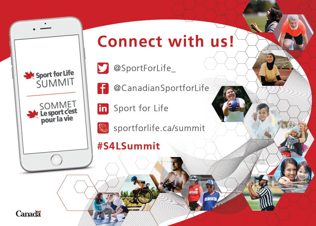
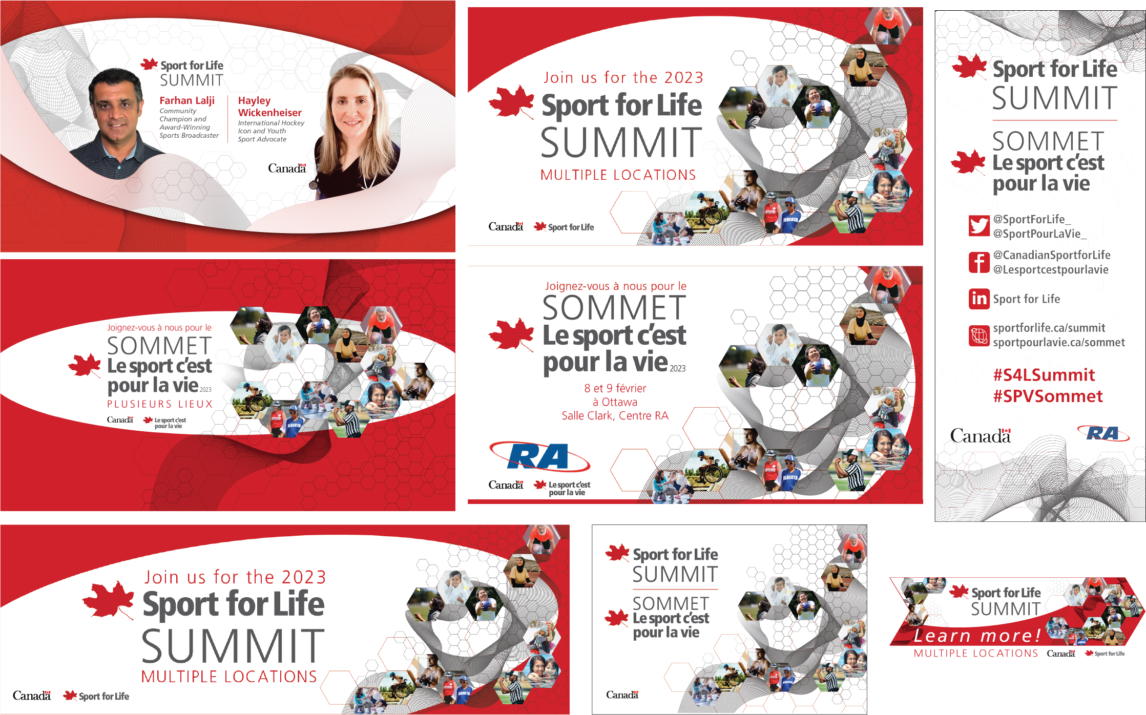
- Social media graphics
- Printed and digital resources (booklets, handouts, interactive forms)
- Presentations and infographics
- Reports and publications
- Video and motion graphics
- Business cards and signage
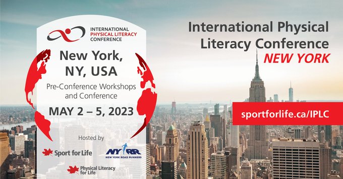
- Promotional materials and ad design
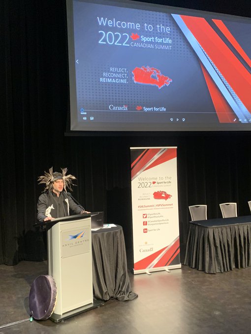
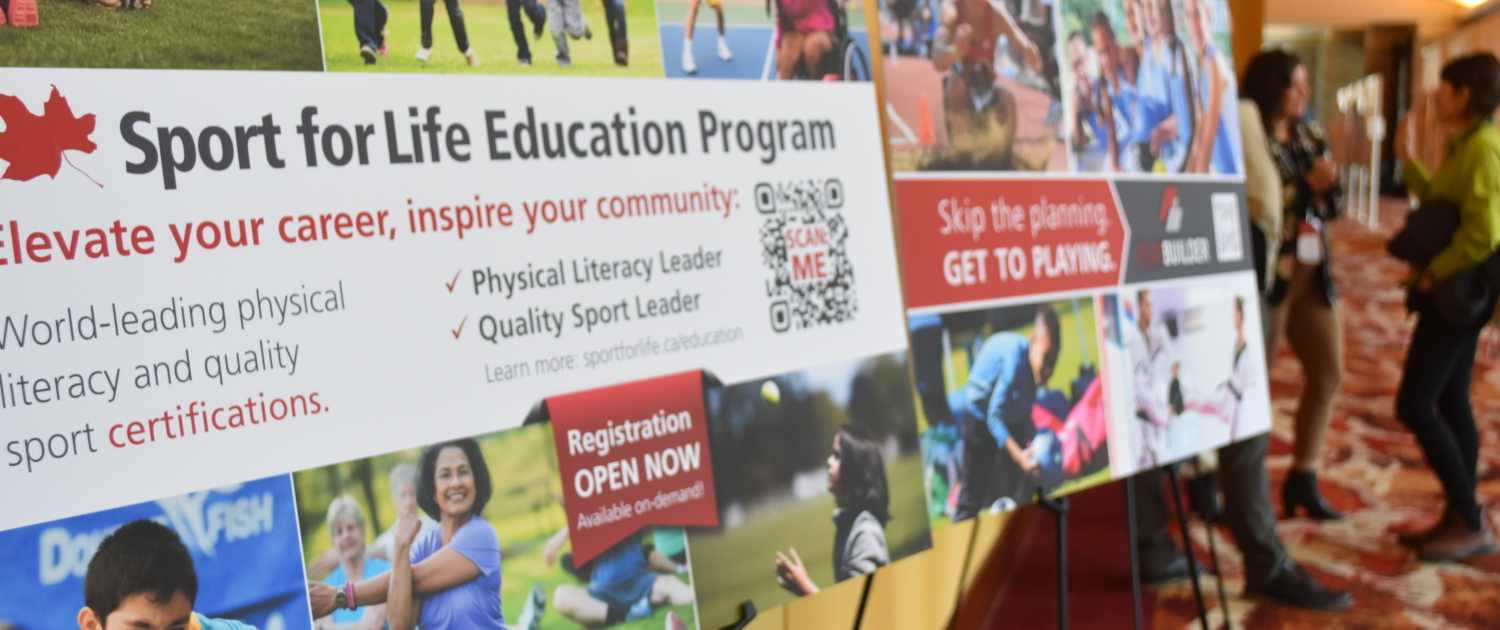
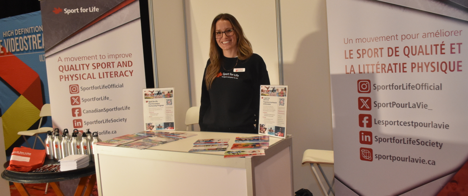
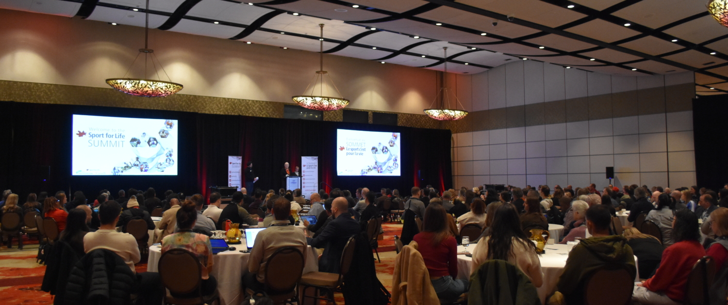
- Tradeshow and event displays
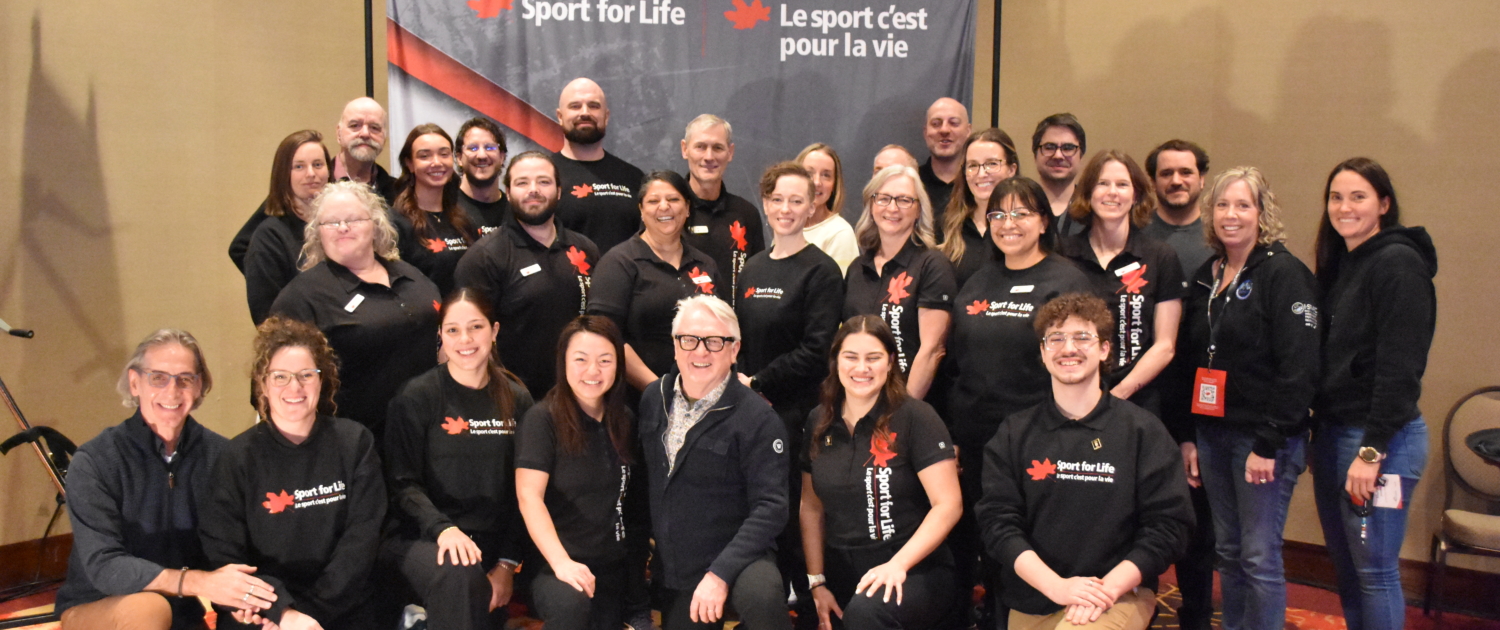
- Prepress and event photography


You must be logged in to post a comment.